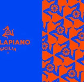
A combination of past and present that transcends time: this is precisely the direction taken by Alkemy, which has created a visual system that updates the look and feel of the brand and communicates all products in an effective, impactful and consistent way.
A chromatic palette with bright and contrasting colors strengthens the bond with the territory also thanks to the use of the historical symbol of the Trinacria, reinterpreted through the insertion of an orange, a representative element of the Parlapian world.
" It took a minute with the Parlapiano brothers to understand how much they loved their land and their products. Hence the desire to restore a highly differentiating visual identity, in which they could also recognize their own passion. And then, help to evolve their Italian realities especially in this historical moment is a source of pride for us, " declares Marco Tironi, creative director responsible for the art direction of Alkemy.
The new visual identity created by Alkemy is consistently declined on all Parlapiano references: Orange of Ribera PDO, Sicilian Orange BIO, Pear Coscia di Ribera and Peach Bivona PGI. For them Alkemy has dealt not only with the study of labels, but also with the design of the packaging.
Paolo Parlapiano, marketing manager of Parlapiano Fruit commented: " Our intention is to enhance historical and rare varieties by focusing on a brand that gives all people the opportunity to discover the unique territorial characteristics of the land of Sicily. We turned to Alkemy because we needed to make our brand more modern and current, defining a "future proof" positioning, therefore able to support the growth of the company with a contemporary cut but far from clichés. on a more technical side, it was necessary to enhance the product certifications, in harmony with the respective logos. Challenge to which, we are sure, the new visual identity will respond successfully ",
In addition to the Parlapiano logo, Alkemy has also created the logo and packaging of Arancia Paradiso, flagship of the Parlapiano production, and the brochure that tells the company and the specificities of its products.
COMMENTS
TO POST A COMMENT YOU MUST BE REGISTERED
No comments on Alkemy chosen by Parlapiano Fruit to redesign the visual identity of the brand have been written yet. Be the first to comment onAlkemy chosen by Parlapiano Fruit to redesign the visual identity of the brand